Designing for “Above the Fold”: Is it Still Relevant?
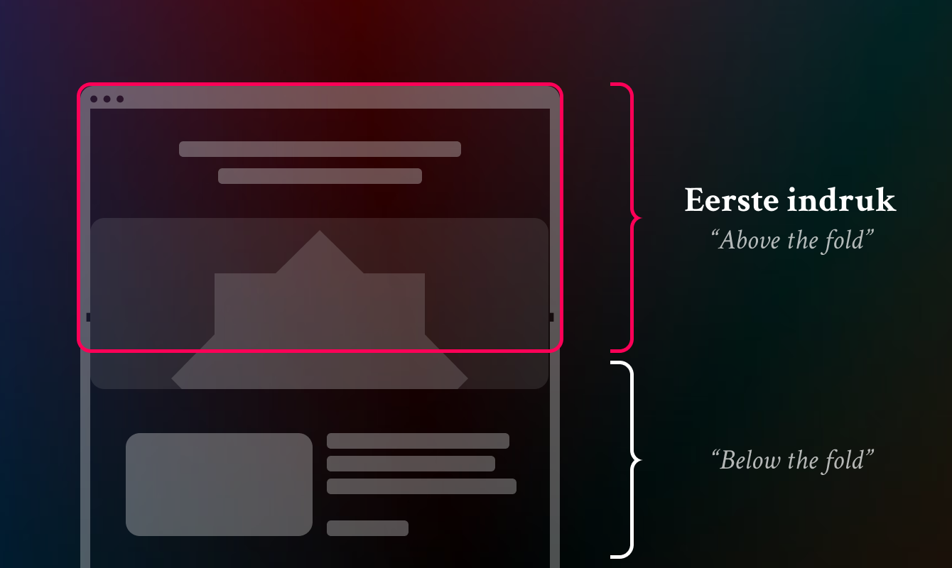
In the world of web design, “above the fold” is a term that refers to the portion of a web page that is visible without the user having to scroll. Originating in the newspaper industry, where the top half of a folded newspaper is the most eye-catching, this concept has been a major focus of digital design for years. But with the rise of mobile devices, changing user habits, and new design techniques, the question arises: is designing “above the fold” still relevant?
Table of contents
Changing User Behavior
In the early days of the internet, “above the fold” was crucial. Users were less comfortable with scrolling and expected the most important information to be immediately visible. Placing compelling content, calls to action, and visual elements at the top of the page was essential to keep the visitor’s attention.
This often led to cluttered designs, where designers tried to cram as much information as possible into a limited screen area. While this approach was effective in the past, the Internet landscape has changed dramatically since then.
The Role of Mobile Design
The shift to mobile devices has further complicated the concept of the fold. Screen sizes vary greatly, from small smartphones to large tablets and desktops. What is “above the fold” on a small screen can be completely different on a larger screen. Determining a universal “fold” has become nearly impossible.
Mobile-friendly design focuses more on responsiveness and creating a fluid user experience than on strictly optimizing a specific screen area.
Why the Fold Can Still Be Important
Although the fold is no longer as crucial as it once was, it remains an important concept in certain contexts:
- First Impression: The top of a page is still the first thing users see. If this area is unappealing or confusing, users may decide to leave the site before scrolling any further.
- Call-to-Action Placement: For commercial websites, a strategically placed button or offer at the top can help convert users immediately.
- Prioritizing Content: While users are willing to scroll, it’s important to place the most relevant and engaging information at the top to generate interest.
Designing for the Fold in Modern Times
Rather than rigidly adhering to the idea of the fold, designers can take a more holistic approach. Here are some tips:
Consider User Goals: Align the structure and content of your page with what users want to accomplish. If a quick action is required, such as a purchase or registration, place the most important elements clearly at the top.
Create Visual Appeal: Use an eye-catching header, catchy headlines, and attractive visuals to entice users to scroll further.
Enter Progressive Reveal: Use scrolling animations and interactive elements to gradually reveal content and keep users engaged.
Finally
While the emphasis on “above the fold” isn’t as prevalent as it once was, it’s still a useful concept to keep in mind. First impressions of a page are still important, but modern user behaviors and device variations have made designing strictly for the fold less relevant.
The focus these days is more on creating an engaging, fluid user experience across the entire page. By striking a balance between what’s displayed at the top and how the rest of the content unfolds, you can create a design that’s effective, engaging, and relevant to the user.


